
W HOTELS WORLDWIDE
A (STYLE) GUIDE TO WORLDWIDE TRAVEL

Global Brand Identity refresh
Before W Hotels expanded globally, it was a small boutique brand predominantly located in the US. To grow into the worldwide brand that it is today, a significant rethinking and rebranding process was undertaken. Working closely with the W Hotels marketing department, I led a team of creatives to rethink the collateral and identity to suit the worldwide market.
At the time of the rebranding, only 20 W Hotels existed. Now there are 67 hotels worldwide, each one offering a unique experience. Many brands have tried to emulate the formula and capture the same excitement as W Hotels, but it continues to define its segment.
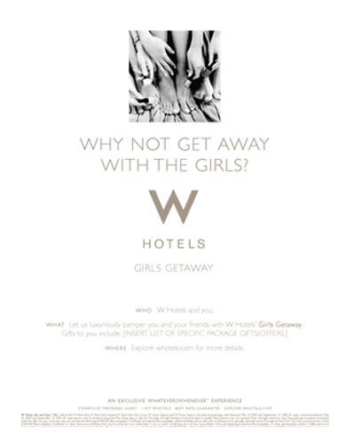
See the related marketing campaigns created tied to the new identity
Creative Direction
Art Direction
Identity Design
Logo Refresh
Global Brand Identity
Corporate Identity
Copy Direction
Style Guide Development
Advertising Collateral
Package Design
Signage Design
Directing
Editing
OS&E
On Property Branding
Social Media Marketing
Website Design
Marketing Campaign

Global Style Guide
The original style guide for W Hotels was a mere few pages before this project began. To take the brand global, a more comprehensive, expressive style guide was needed to expand the brand,
The only things we kept were the logo and the term “Whatever/Whenever” that they were already using in some form.
We started there and took it way beyond the local market and into the global brand it is today.


WHATEVER /WHENEVER
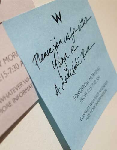
To coincide with the rebranding, a library of W Hotels-style perfect moments was created for in hotel programming and VIP events.


